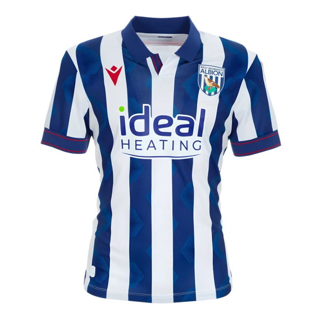
New home kit
#51
(07-17-2026, 10:47 AM)Josh1873 Wrote: I really do believe Macron are copping some unfair stock for our recent kit designs. They've produced some really nice shirts.

The only issue I have with this season's home shirt is the fact the back is plain blue.

This.

They’ve looked like “proper” Albion kits to me.

I don’t know what folk want.
Reply
#52
(07-17-2026, 10:59 AM)backsidebaggie Wrote:
(07-17-2026, 10:47 AM)Josh1873 Wrote: I really do believe Macron are copping some unfair stock for our recent kit designs. They've produced some really nice shirts.

The only issue I have with this season's home shirt is the fact the back is plain blue.

This.

They’ve looked like “proper” Albion kits to me.

I don’t know what folk want.

The right shade of blue would be nice.
Reply
#53
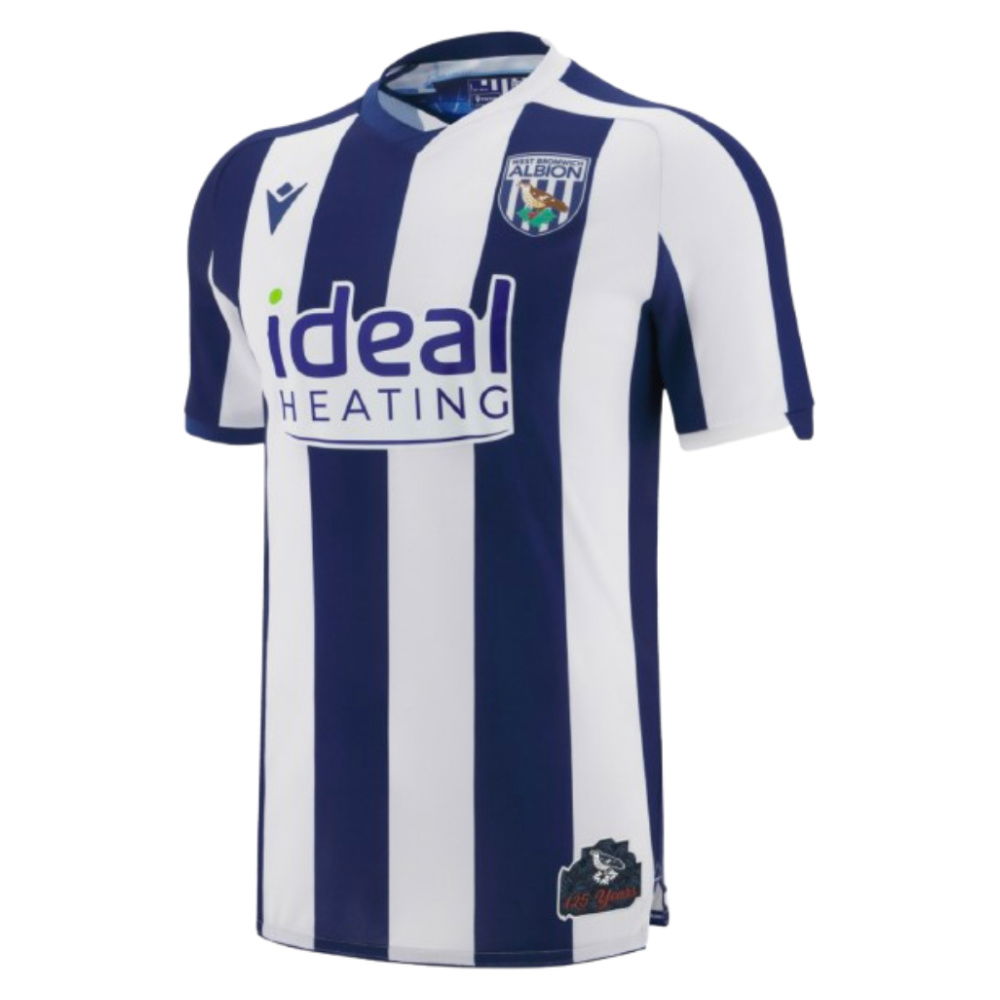
[Image: re_1722296294_2024-2025-west-brom-macron...-650x0.jpg]

[Image: re_1760654783_2025-26-west-bromwich-macr...-shirt.jpg][Image: 5787-500.jpg?v=1784187769]

I think that's 3 seasons of very decent home shirts, personally.
Reply
#54
(07-17-2026, 11:11 AM)Duffers Wrote:
(07-17-2026, 10:59 AM)backsidebaggie Wrote:
(07-17-2026, 10:47 AM)Josh1873 Wrote: I really do believe Macron are copping some unfair stock for our recent kit designs. They've produced some really nice shirts.

The only issue I have with this season's home shirt is the fact the back is plain blue.

This.

They’ve looked like “proper” Albion kits to me.

I don’t know what folk want.
The right shade of blue would be nice.

I thought last seasons blue was about right.

I do like the very dark navy, but I believe it was a touch lighter in the 1950s, so it’s not unprecedented for the blue to vary.

Disappointed in the plain back, and lack of red numbers this year, but macron haven’t been bad IMO.
Reply
#55
(07-17-2026, 11:11 AM)Josh1873 Wrote: [Image: re_1722296294_2024-2025-west-brom-macron...-650x0.jpg]

[Image: re_1760654783_2025-26-west-bromwich-macr...-shirt.jpg][Image: 5787-500.jpg?v=1784187769]

I think that's 3 seasons of very decent home shirts, personally.

Boring. 

Compare to what Puma produced for our home shirts and its chalk and cheese.
Reply
#56
It's blue and white stripes. I'm not sure how boring or excited you can get over that!

I think Puma fucked up more than Macron, considering we had one season without stripes as our home kit!

I mostly enjoyed the Puma kits, btw. Particularly the 70s style one in our play-off season before COVID, and then the barcode one during COVID.
Reply
#57
(07-17-2026, 02:26 PM)Josh1873 Wrote: It's blue and white stripes. I'm not sure how boring or excited you can get over that!

I think Puma fucked up more than Macron, considering we had one season without stripes as our home kit!

I mostly enjoyed the Puma kits, btw. Particularly the 70s style one in our play-off season before COVID, and then the barcode one during COVID.

Puma used originality and tried to be innovative on our strips. Macron are giving us lower league templates. And the quality is shite.
Reply
#58
(07-17-2026, 03:46 PM)Dumbo Wrote:
(07-17-2026, 02:26 PM)Josh1873 Wrote: It's blue and white stripes. I'm not sure how boring or excited you can get over that!

I think Puma fucked up more than Macron, considering we had one season without stripes as our home kit!

I mostly enjoyed the Puma kits, btw. Particularly the 70s style one in our play-off season before COVID, and then the barcode one during COVID.

Puma used originality and tried to be innovative on our strips. Macron are giving us lower league templates. And the quality is shite.

Looks OK to me other than the blue is not really navy.  Couldn't give a shit about how a stripe can otherwise look innovative.  Did they glow in the dark?
Reply
#59
Turns out it could have been worse….

https://x.com/theshirtunion/status/20781...qkPwh6EZ-w
Reply
#60
I like the idea and concept, it's actually a lovely touch.

Shit execution, however.
Reply


Forum Jump:


Users browsing this thread: 2 Guest(s)