07-08-2026, 10:22 AM
Red is actually on the badge too.... the berrys on the Hawthorn bush.
|
New kit
|

07-08-2026, 10:22 AM
Red is actually on the badge too.... the berrys on the Hawthorn bush.
07-08-2026, 11:05 AM
(07-08-2026, 09:52 AM)richbaggie Wrote: I have seen a lot of people not happy with red and saying it's not an Albion colour. We've worn red for our 1st change away kit 11 times in the last 30 years. It's still not an Albion colour. And I regularly say so. 11 times in the last 30 years! I can remember when, early 60s, the pre season was Albion A vs Albion B at the Hawthorns. B wore red. I didn't like it! If a club has an identity it's partly in the kit. Look at the opposition to Cardiff s Thai owners wanting red instead of blue. The Villa often, I believe, have an away kit in blue and claret... Sensible IMO. We am stripes! 
07-08-2026, 11:08 AM
(07-08-2026, 11:05 AM)Johnnykayeengland Wrote:(07-08-2026, 09:52 AM)richbaggie Wrote: I have seen a lot of people not happy with red and saying it's not an Albion colour. We've worn red for our 1st change away kit 11 times in the last 30 years. Your identity is your home kit. The away matters far less.
07-08-2026, 11:15 AM
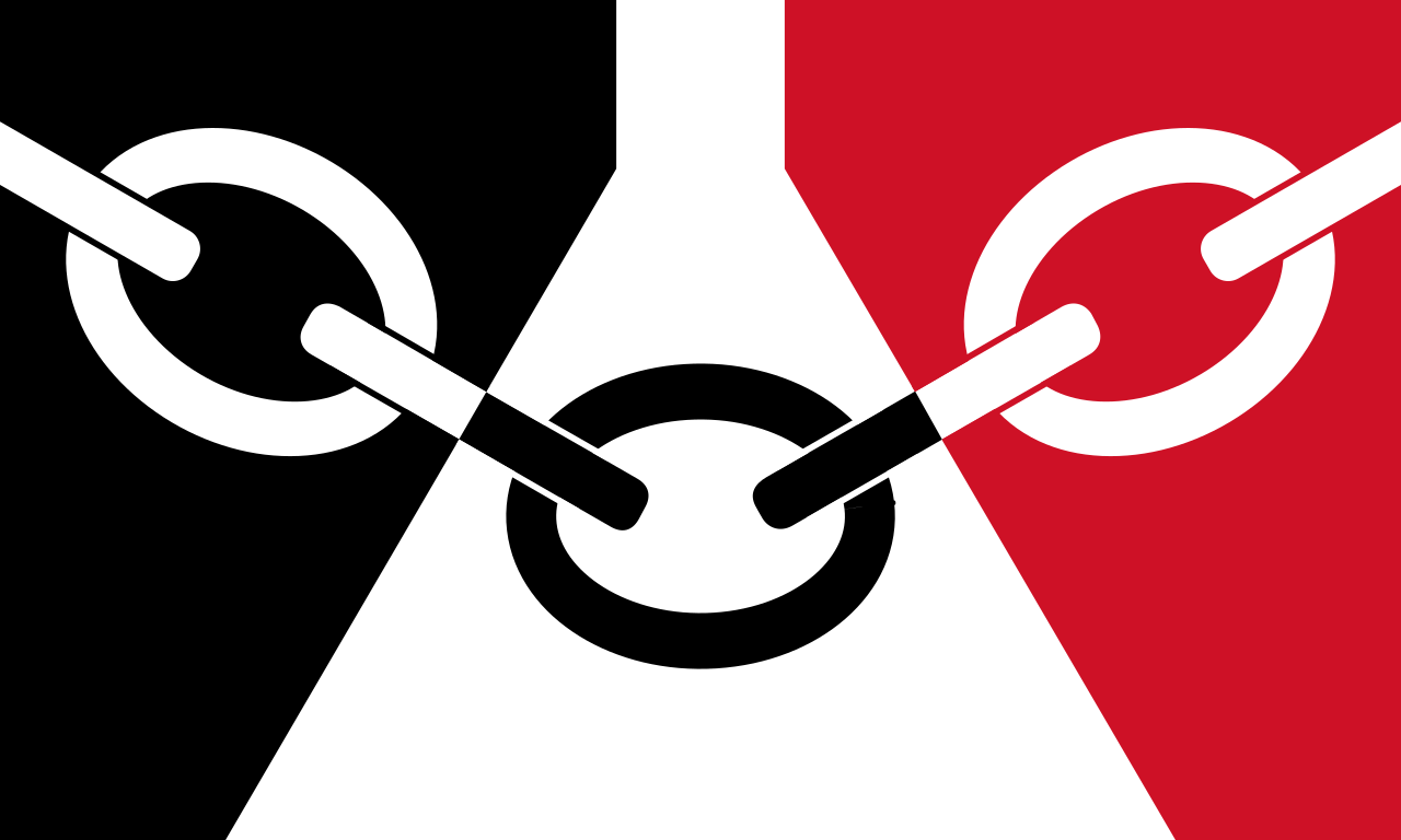
Looks ok and I like the inclusion of the glass cone. Would love to see the actual Black Country flag on it as well though, either where the WBA is on the back or a small rendition of it below the club crest on the front.
07-08-2026, 11:23 AM
(07-08-2026, 09:58 AM)Josh1873 Wrote: Yeah, I'm not sure why the dislike of red?! I can only make choices based on the data available at the time!! 
07-08-2026, 11:29 AM
(07-08-2026, 09:34 AM)Dumbo Wrote: A mid table Championship kit if ever I saw one. An improvement on last season It's a bit meh - I get the marketing behind changing things, but for me, Blue and White at home, Yellow and Green away, and do whatever you want for the third as long as it isn't claret or orange!
07-08-2026, 11:32 AM
Think it's decent, I've liked all our recent red kits though tbh.

07-08-2026, 11:40 AM
(07-08-2026, 10:18 AM)SmethwickEnd Wrote: I cant believe people haven’t noticed it’s the Black Country flag. “No effort” “bog standard” “glass cone” Is this a whoosh for me? The flag shape is based on the glass cone, and the article for the launch specifically references the Red House Glass Cone in Stourbridge.
He’s gorra gew, Franksy!
|
|
« Next Oldest | Next Newest »
|