


03-05-2025, 02:27 PM
Which one didn't need tweaking though???
|
Wst Brmwch lbn
|
03-05-2025, 02:33 PM
1969, 70's, 72, 73, 75, 86, 94, 2000 and 2001 are infinitely better than 2006 and 2011.

03-05-2025, 02:40 PM
That 1972 one should definitely be brought back for a future away shirt.

03-05-2025, 02:43 PM
Gorra have a Throstle on it ay it (is what my old mon would say).
However, I do like the simplicity of 75's WBA. Which IMO should be the away emblem.
03-05-2025, 02:52 PM
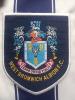
(03-05-2025, 02:43 PM)SausEggBaton Wrote: Gorra have a Throstle on it ay it (is what my old mon would say). I liked the 90's shirts when we had the coat of arms badge, but always incorporated a throstle into the shirt. I'm biased, perhaps, as the mid-90's when this was done is when I first got into supporting us, and my first kits had this badge.
03-05-2025, 02:59 PM
(03-05-2025, 02:52 PM)Josh1873 Wrote:(03-05-2025, 02:43 PM)SausEggBaton Wrote: Gorra have a Throstle on it ay it (is what my old mon would say). Guest Motors shirt FTW. Iconic.
03-05-2025, 03:45 PM
1970s. A thing of beauty. And the subject of 90% of the tattoos you'll see on any summers day at the Hawthorns.
03-05-2025, 04:05 PM
03-05-2025, 04:13 PM
You can tell no ornithologists were involved in the design of the 2000's badges. Shockingly inaccurate depiction of the breast speckles, primary and secondary wing feathers and the upper and lower mandibles. Sort it, Shilen.
03-05-2025, 06:05 PM
(03-05-2025, 07:18 AM)Josh1873 Wrote:(03-04-2025, 04:56 PM)Old Fart Wrote:(03-04-2025, 03:13 PM)Josh1873 Wrote: Is it me or are rebrands and new logos just complete shite? Always thought the new Oldham one looked like it belonged on a beer pump instead of a football top. |
|
« Next Oldest | Next Newest »
|